Role
Product Designer
Tools
Figma, Maze, Jira, Storybook
Timeline
April 2022 - April 2024
Reach
450,000+ flights per year
6 major Alaska Airline hubs
Team
1 designer (me)
1 project manager
Engineering team
Role
Product Designer
Tools
Figma, Maze, Jira, Storybook
Timeline
April 2022 - April 2024
Reach
450,000+ flights per year
6 major Alaska Airline hubs
Team
1 designer (me)
1 project manager
Engineering team
Overview
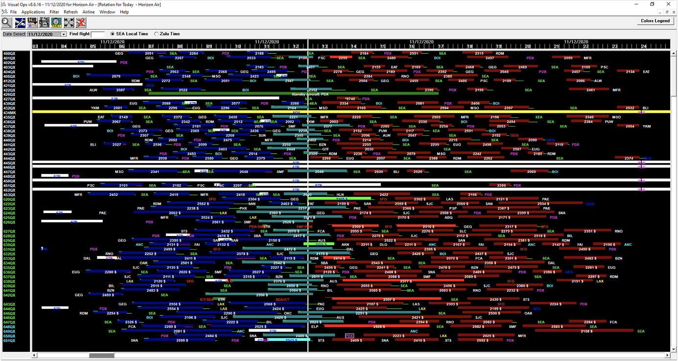
AirtrAK is an internal tool used by Alaska Airlines dispatchers to manage irregular operations, such as delays, emergencies, and maintenance. The existing dashboard was difficult to scan and hadn’t been meaningfully updated in years.
I redesigned a flight management dashboard to be faster to read and easier to act on, without disrupting the mental models people depended on under pressure. The redesign resulted in a 30% increase in operational efficiency and a 20% reduction in user errors, improving operations for over 1 million flights since rollout.
Phase 1: Foundational Research
Dispatchers managing irregular operations work under real-time pressure with no margin for confusion. The existing AirtrAK dashboard presented dense, hard-to-scan data with limited filtering and no customization. But the tool was deeply ingrained in daily workflows; Any redesign that broke existing mental models risked dangerous confusion during emergencies.
To fully understand their mental models, I spent time observing dispatchers during active shifts, including a live delay cascade triggered by weather at SEA. I then ran a card sorting exercise with six dispatchers to understand how they mentally organized their work.
Key Findings:
Dispatchers leveraged 6+ data sources and tools simultaneously, talking on headsets and making decisions in parallel. They often switched between multiple windows, scrolling through hundreds of rows to find a handful of urgent flights.
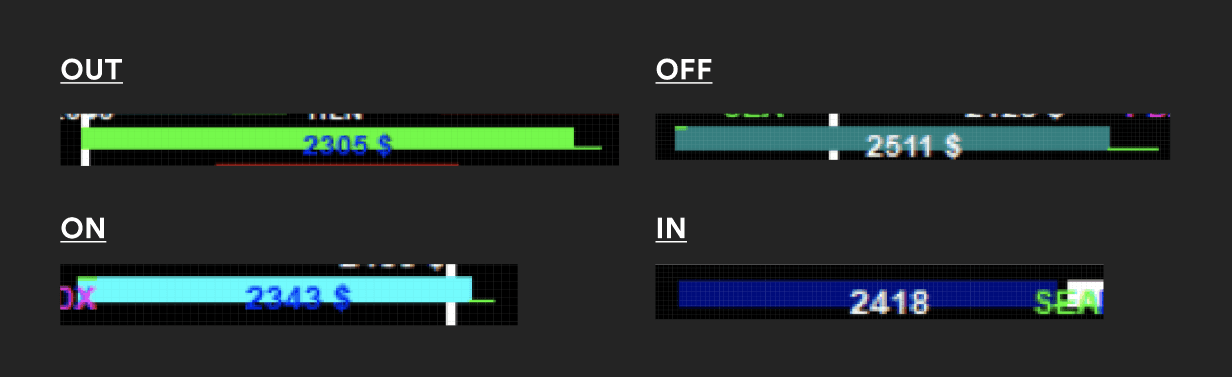
Dispatchers struggled to read flight pucks. The text didn't fit inside pucks, color contrast was poor, and they had to cram hundreds of flights on their screens.
Dispatchers relied heavily on scanning for colors and hubs to find flights. When they found these flights, they struggled to keep track of them amongst the visual noise.
Swapping an aircraft required leaving the dashboard entirely, losing their place in the flight list.
The most common workaround was to add a second monitor, but it still wasn’t enough space for all the information they wanted on screen.
Additional Risks:
Dispatchers couldn't stop managing flights to train on a new system.
They had deep muscle memory with the existing tool, so changes had to be gradual.
They admitted that context switching was overwhelming, but they were more worried about adjusting to big changes in AirtrAK while keeping up their workload.
"I can't stop and think about where a button is in an emergency. The old tool was ugly, but I knew where everything was."
— Senior dispatcher, contextual interview
Resulting User Stories:
How do we make status legible without removing the colors users depend on?
How do we let users monitor flights without getting lost in the visual noise?
How do we let users swap aircraft without losing their place in a live operation?
Phase 2: Iteration & Testing
Standard usability testing wasn’t sufficient for a safety-critical tool. I worked with ops to design scenario-based tests using real historical irregular operational data. We replicated actual irregular ops events (weather cascades, maintenance holds, gate conflicts) and timed how quickly dispatchers could identify and action critical flights. The existing tool was timed first to establish a baseline. All three features were tested against that benchmark across three rounds, with the same dispatchers each time so learning effects could be controlled for.
Challenge 1: Status legibility
Idea 1: Color + icon
First attempt added a small icon (⚠ ✗ ✓) alongside the color highlight. Tested in a simulated 15-flight scenario with 6 dispatchers using historical delay data. Found that icons added cognitive noise; dispatchers were already scanning fast and the icons created a second decoding step rather than reinforcing the color.
Idea 2: Status as a new column
Replaced icons with a text label in a dedicated column (“Delayed”, “Maintenance”, “On time”). These were faster to scan, but the new column shifted gate and tail # positions to the right. Dispatchers with years of reflex-scanning that column layout were briefly disoriented. This surfaced a constraint that shaped everything else: any addition had to be additive without displacing anything.
Idea 3: Badge inside the route cell (Success)
Moved the status label into the existing route cell as a compact badge. This way, every other column stayed exactly where dispatchers expected it. The badge used color fill and text, satisfying both the accessibility requirement and dispatcher color preferences.
Result: Tested against baseline, the status identification time dropped from 2.1s to 0.8s per flight.
“Retraining people on new colors is not an option. The redesign has to feel familiar enough that no one hesitates.”
— Senior dispatcher, round 3 testing
Challenge 2: Flight monitoring
Idea 1: Tab-based views
The first concept was tabs, one per hub (SEA, PDX, ANC, LAX) since this seemed simple and familiar. A problem surfaced immediately in scenario testing, where dispatchers couldn't switch fast enough between 2 tabs with emergency scenarios. (For example, a Seattle (SEA) weather event in one tab and a maintenance queue in another.) Tabs required a full context switch; they couldn’t glance across both simultaneously.
Idea 2: Resizable split panes
Two resizable panes side by side, each with independent filter state. This would allow simultaneous monitoring, since dispatchers could see both contexts at once. Tested well within sessions. But a new problem arose, where pane state didn’t persist between sessions. Dispatchers rebuilt their layouts from scratch at the start of every shift. This was especially painful during handoffs, when an incoming dispatcher needed to be operational immediately.
Idea 3: Named saved windows with auto-restore
Added window naming and server-side persistence, so that each dispatcher’s layout, filter state, and column widths restored on login. Added a preset library pre-populated with common configurations (SEA departures, maintenance queue, all irregular ops).
Result: Dispatchers were operational in under 30 seconds post-login vs. the previous ~4 minutes of manual setup.
"I set it up once on my first day and haven’t thought about it since. It just comes back exactly how I left it.”
— Dispatcher, 3 weeks after rollout
Challenge 3: Flight swap
Idea 1: Centered modal
The first concept was presenting the swap function in a modal. However, this still covered critical context to complete the swap. The dispatcher would close the modal, check which flights needed swapping, and then return to the modal. Sometimes they would check multiple times.
Idea 2: Slide-out drawer
I designed a slide-out drawer from the right, overlapping the dashboard partially. Dashboard stayed partially visible, which was better than navigating away. However, the drawer covered flight pucks that dispatchers needed to reference while filling in swap details. I observed repeated open/close behavior in testing as dispatchers checked values, closed the drawer, confirmed, reopened.
Idea 3: Swap mode, target row highlighted
The final design was a swap "mode". This mode showed a border around the dashboard, with compact swap controls at the bottom. The target flight rows were highlighted, so that dispatchers could visually see what flights were being swapped. This allowed the user to view the full dashboard while swapping, reducing the number of steps in the original workflow.
Result: Flight swap steps reduced from 6 steps to 3. Context is preserved throughout, leading to 0 swap errors in testing.
“The old way, I’d come back to the list and have to find where I was. Now I can see the flight the whole time and I never lose it.”
— Senior dispatcher, round 3 testing
Phase 3: Implementation & Rollout
I worked with my project manager, the flight operations team, and our engineering team to support rollout and adoption across regional airline hubs. This looked like:
Creating dev handoff files
Conducting QA on implementation before release
Coordinating with the flight ops team to facilitate user-acceptance testing
Flying to other hubs to conduct small trainings, observe adoption, and collect feedback directly from users
Working Within Constraints
These solutions worked because they were minimally disruptive, either working as an addition (not a replacement) or familiar enough to the original workflow to adopt quickly. Larger design overhauls were justified with research that highlighted existing usability issues and explained the potential return on investment. In other words, I did my homework and respected the dispatchers existing workflows, and we shipped several successful feature improvements as a result.
However, there were several usability issues that could not be fixed with just additions. For one example (among many), certain colors and typography do not meet contrast accessibility standards. These issues make up a design backlog, where we slowly introduced changes that had to subtract or replace. This was done with the dispatchers' full knowledge and plenty of training time and resources. This way, operations is not disrupted with sudden changes.
Outcome
The redesign resulted in a 30% increase in operational efficiency and a 20% reduction in user errors across the tool. The incremental rollout meant zero disruption to live operations. In addition, the operations team had no design system to begin with. so I adapted another Alaska Airlines internal design system and tailored it to their needs. These design system contributions made future tooling updates significantly faster to ship.