Role
Product Designer
Tools
Figma, Maze, Jira, Storybook
Timeline
April 2022 - April 2024
Reach
450,000+ flights per year
6 major Alaska Airline hubs
Team
1 designer (me)
1 project manager
Engineering team
Overview
AirtrAK is an internal tool used by Alaska Airlines dispatchers to manage irregular operations, such as delays, emergencies, and maintenance. The existing dashboard was difficult to scan and hadn’t been meaningfully updated in years.
I redesigned a flight management dashboard to be faster to read and easier to act on, without disrupting the mental models people depended on under pressure. The redesign resulted in a 30% increase in operational efficiency and a 20% reduction in user errors, improving operations for over 1 million flights since rollout.
Phase 1: Foundational Research
Dispatchers managing irregular operations work under real-time pressure with no margin for confusion. The existing AirtrAK dashboard presented dense, hard-to-scan data with limited filtering and no customization. But the tool was deeply ingrained in daily workflows. Any redesign that broke existing mental models risked dangerous confusion during emergencies.
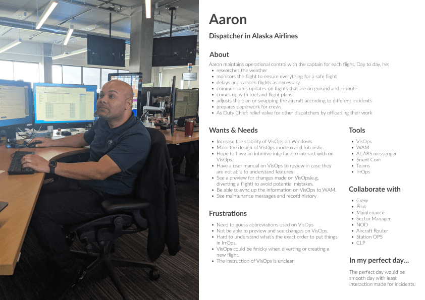
To fully understand their mental models, I spent time observing dispatchers during active shifts, including a live delay cascade triggered by weather at SEA. I created 6 personas to understand each user's needs, frustrations, and tools. I then ran a card sorting exercise with six dispatchers to understand how they mentally organized their work.
Figure 1: Example personas for sector managers and dispatchers in the flight operations team.
Current Pain Points:
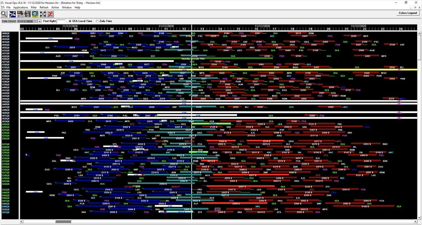
Dispatchers leveraged 6+ data sources and tools simultaneously, talking on headsets and making decisions in parallel. They often switched between multiple windows, scrolling through hundreds of rows to find a handful of urgent flights (Fig. 2).
Dispatchers relied heavily on scanning for colors and hubs to find flights. When they found these flights, they struggled to keep track of them amongst the visual noise (Fig. 3).
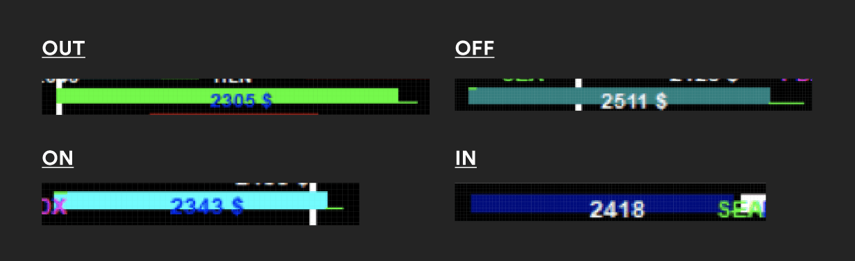
Dispatchers struggled to read flight pucks. The text didn't fit inside pucks, color contrast was poor, and they had to cram hundreds of flights on their screens (Fig. 4).
The most common workaround was to add a second monitor, but it still wasn’t enough space for all the information they wanted on screen.
Figure 2: Picture of a flight dispatcher's desk and their many tools.
Figure 3: The original version of AirtrAK, called VisOps.
Figure 4: Flights in various stages of flight takeoff and landing.
Redesign Constraints:
Dispatchers couldn't stop managing flights to train on a new system.
They had deep muscle memory with the existing tool, so changes had to be gradual.
They admitted that context switching was overwhelming, but they were more worried about adjusting to big changes in AirtrAK while keeping up their workload.
Resulting User Stories:
How do we make status legible without removing the colors users depend on?
How do we let users monitor flights without getting lost in the visual noise?
How do we let users swap aircraft without losing their place in a live operation?
With these three questions in hand, I moved into designing and testing solutions for each.
"I can't stop and think about where a button is in an emergency. The old tool was ugly, but I knew where everything was."
— Senior dispatcher, contextual interview
Phase 2: Iteration & Testing
Establishing a Design System
Based on user and business needs, I decided to first redesign this tool's visual design - including new colors, spacing, and components - while preserving core workflows to avoid disrupting users. This effort paired with a full engineering overhaul, replacing legacy code to make the app easier to maintain and scale. Any major workflow changes were planned for post-overhaul.
Figure 5: Navigation and dashboard components
Figure 6: Flight puck components
Testing Methodology
Standard usability testing wasn’t sufficient for a safety-critical tool. I worked with flight ops to design scenario-based tests using real historical irregular operational data. We replicated actual irregular ops events (weather cascades, maintenance holds, gate conflicts) and timed how quickly dispatchers could identify and triage critical flights.
I first tested the existing tool to establish a performance baseline, like task completion time and number of user errors. Each design then underwent those same scenario-based tests across three rounds with the same dispatchers. I varied scenario order and re-tested the original tool's baseline at the end to rule out memorization effects.
Challenge 1: Status legibility
Problem
Flight status was not clearly legible due to the lack of space and color contrast between the text and the puck background. However, users are accustomed to the existing color coding. I explored ideas to the flight puck design for better legibility and scanning.
Users especially needed to see 4 primary flight statuses - OUT, OFF, ON, IN. These indicate where the plane is physically located during a flight.
Idea 1: Badges and Patterns
First attempt were to use patterns or badges to indicate status. I had 15 users evaluate static mockups to provide feedback on the concepts.
The pattern design failed in user testing. In fact, users hated it and ranked it the lowest. General feedback was that it was too overwhelming. It'd require too much training and, with it, concerns of it scaling. Many users were drawn to the badge designs, which indicated users were open to using identifiers over color. But ultimately, the concern with these was scaling. At a small scale, we cannot see clearly what the status is at a glance.
Ultimately, these ideas were scrapped in favor of the next idea.
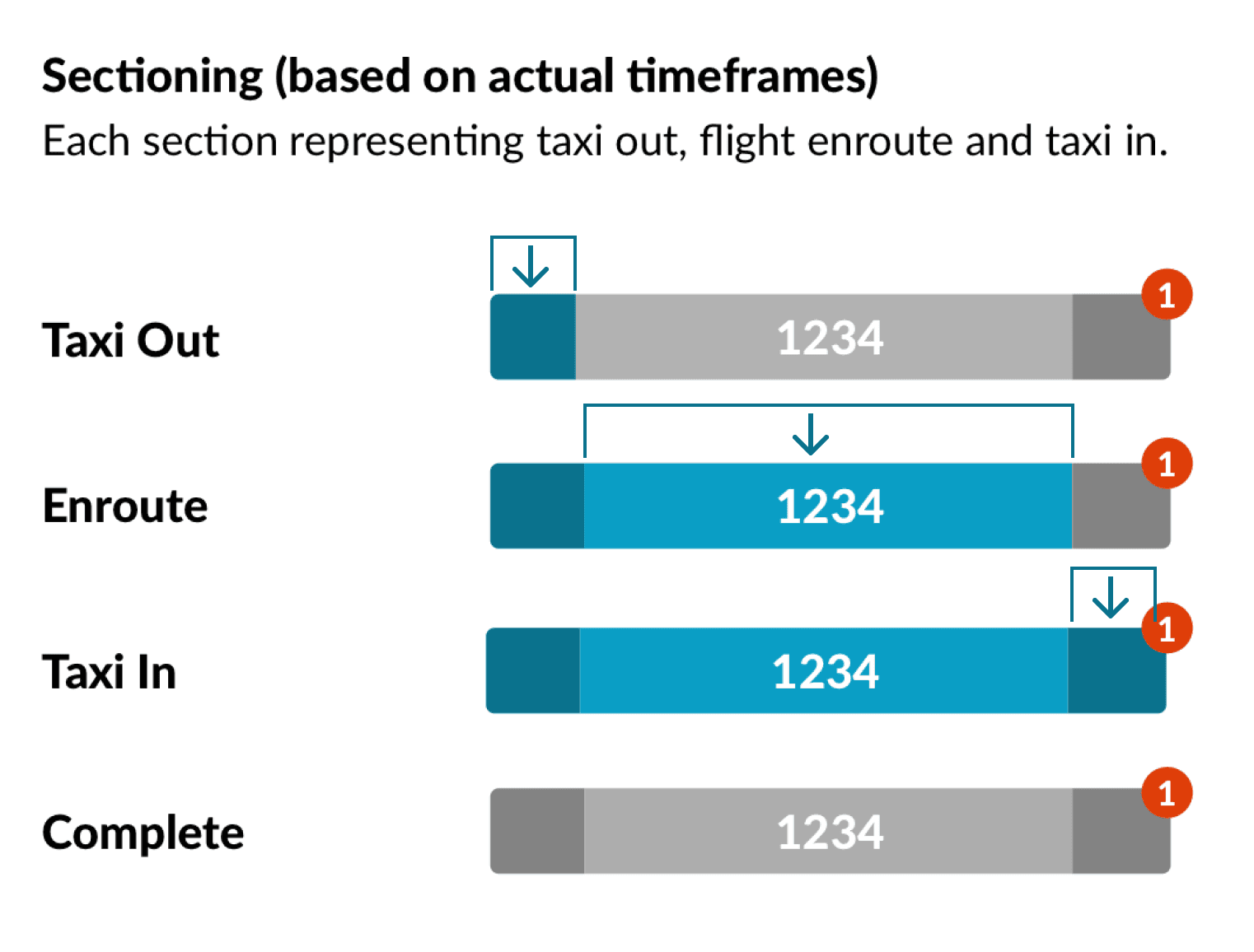
Idea 2: Sections
This design consolidated the OOOI statuses into a single puck. The user can understand the flight status based on which section the "now" line is hovering over. This also reduces the number of colors used (6 to 3) and is color blind-friendly.
Users highly ranked this design from the static mockups. However, when iterated on and then tested in a simulated 15-flight scenario with 6 dispatchers using historical data, we found that users struggled to adapt to such a drastic change in the design. Reading pucks was too fundamentally different from just interpreting a color and equating its status.
Idea 3: Color-coded
Because users couldn't quickly adapt to the sectioned puck design, business requested to revert back to traditional OOOI pucks (individual colors for OUT, OFF, and ON). This included scrapping light mode.
Retraining people on new colors was not an option if there was any slowdown in operations, even if temporary and planned. With that option gone, I redesigned the pucks to use the same colors as before, but with high contrast text colors and increased padding for legibility.
Then in order to make these pucks easy to find in the visual noise, I decided to make these status colors stand out instead. Through careful user testing, I was able to consolidate any similar existing color statuses (anything blue or green) to use different colors. This way, any pucks that are blue or green would instantly be recognized as an OUT, ON, or OFF status. (The IN color, gray, was less important to highlight since it marks the flight as complete.)
This way, users could retain their hard-wired color recognition, while navigating less visual noise in the tool.
Result
Tested against baseline, the status identification time dropped from 2.1s to 0.8s per flight. This design provides more information at a glance, making it easier to answer questions like “Why is my aircraft not in the air?” and “How long was the aircraft on the tarmac?”
“Retraining people on new colors is not an option. The redesign has to feel familiar enough that no one hesitates.”
— Senior dispatcher, round 3 testing
Challenge 2: Flight monitoring
Problem
In order to monitor many flights and hubs, users often had multiple windows of the same tool open. Users often struggled to set up and monitor so many windows at once, often losing their window among a sea of other windows during safety-critical operations. My goal was to reduce visual noise and save time by making it easier to manage and monitor their workspace.
Figure 7: Example of multiple windows open on their screen.
Figure 8: Brainstorm sketches for managing multiple environments (views) in one window.
Idea 1: Tab-based views
The first concept was tabs, one per hub (SEA, PDX, ANC, LAX) since this seemed simple and familiar. A problem surfaced immediately in scenario testing, where dispatchers couldn't switch fast enough between 2 tabs with emergency scenarios. (For example, a Seattle (SEA) weather event in one tab and a maintenance queue in another.) Tabs required a full context switch; they couldn’t glance across both simultaneously.
Figure 9: Users can't rely on simply tabbing across environments / views; they needed to see multiple simultaneously.
Idea 2: Resizable split panes, pre-set layouts, and view lists
I focused on allowing multiple views (environments) within a single window, plus methods to manage them. My first step was to introduce resizable panes side by side, each with independent filter state. This would allow simultaneous monitoring, since dispatchers could see both contexts at once. This tested well within sessions but, by default, the views were freeform (and therefore still disorganized) within the tool, slowing users down.
In order to manage the chaos of multiple views, I introduced:
window naming (allowing users to name environments for personal reference)
preset layouts (e.g. columns, rows, grid), and
a view list (which showed each window name, and the order they were created)
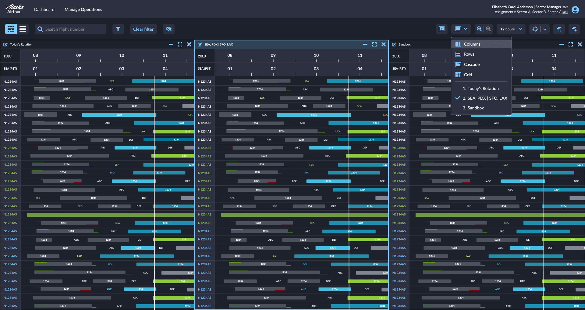
Preset layouts allowed the user to organize their windows into whichever layout they preferred, instantly making all windows viewable and organized. The view list allowed users to pick a view by name, quickly finding a specific view when needed.
Figure 10: Example of a user arrange windows freeform within the tool. Because of the ability to find windows in the dropdown list + choose a preset layout, users can quickly find what they're looking for.
Figure 11: Users can now see multiple views (environments) simultaneously. Users can pick pre-set layouts, bring certain windows to the front, or arrange their views freeform.
Figure 12: Screenshot of this feature's Figma page, explaining any new changes in components and behaviors.
Idea 3: Named saved windows with auto-restore
But a new problem arose, where pane state didn’t persist between sessions. Dispatchers rebuilt their environments from scratch at the start of every shift. This was especially painful during handoffs, when an incoming dispatcher needed to be operational immediately.
After discussing technical feasibility with devs and tradeoffs with business, we added window naming and server-side persistence, so that each dispatcher’s layout, filter state, and column widths restored on login. We also added a preset library pre-populated with common configurations (SEA departures, maintenance queue, all irregular ops).
Result
Tested against baseline, dispatchers were operational in under 30 seconds post-login vs. the previous ~4 minutes of manual setup. Navigating between environments also went from 6 seconds on average to 2 seconds. This design allows users to quickly set up their environments and navigate between one view to the next seamlessly.
"I set it up once on my first day and haven’t thought about it since. It just comes back exactly how I left it.”
— Dispatcher, 3 weeks after rollout
Challenge 3: Flight swap
Problem
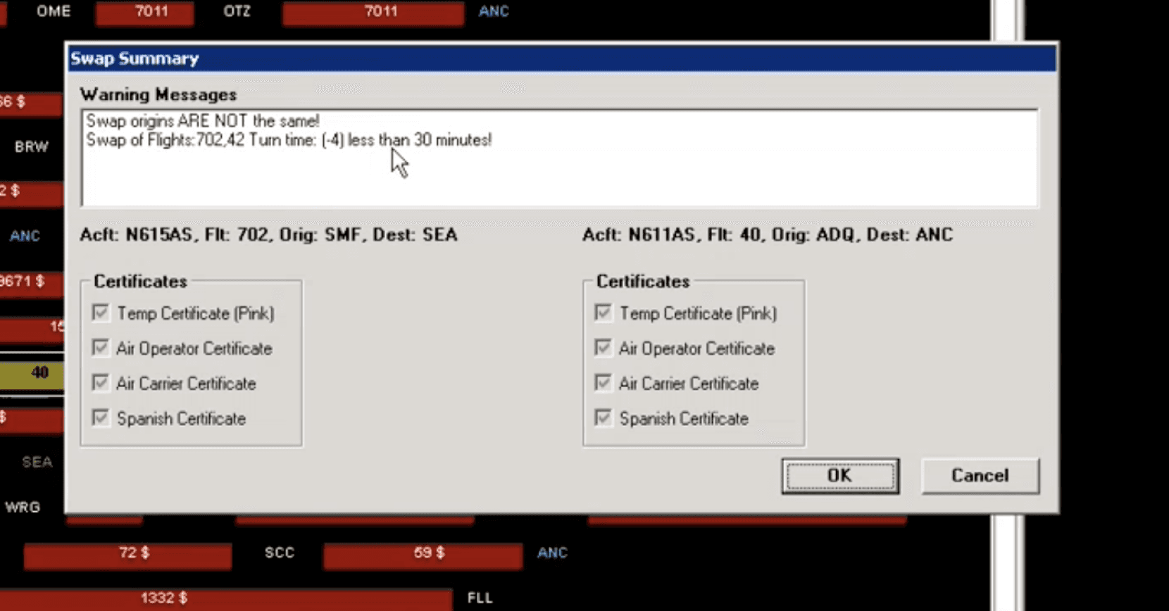
The most common workflow in flight ops was swapping aircraft, whether for maintenance needs or weather delays. For users, swapping aircraft is a heavily visual task, where they need to constantly reference the dashboard of flight pucks to see which flights can handle the swap.
However, conducting a swap required opening a modal that blocked the dashboard - blocking their visual references. Because it's such a critical task, users often triple and quadruple checked their work before authorizing the swap, which looks like bouncing back and forth 3-4 times between the dashboard and Swap Aircraft modal. I decided to design a way to swap aircraft within the dashboard, so that users don't lose their visual references while swapping.
Idea 1: Moveable modal
The first concept was presenting the swap function in a movable modal. However, this still covered critical context to complete the swap. The dispatcher would still close the modal, check which flights needed swapping, and then return to the modal. Sometimes they would check multiple times.
Idea 2: Slide-out drawer
I designed a slide-out drawer from the right, overlapping the dashboard partially. Dashboard stayed partially visible, which was better than navigating away. However, the drawer covered flight pucks that dispatchers needed to reference while filling in swap details. I observed repeated open/close behavior in testing as dispatchers checked values, closed the drawer, confirmed, and reopened.
Idea 3: Swap mode, target row highlighted
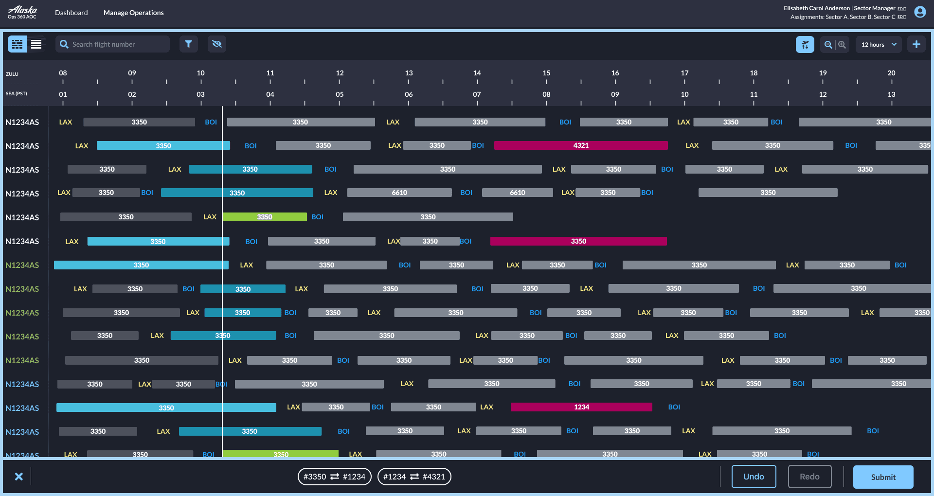
The final design was a swap "mode". This mode showed a border around the dashboard, with compact swap controls at the bottom. The target flight rows were highlighted, so that dispatchers could visually see what flights were being swapped. This allowed the user to view the full dashboard while swapping, reducing the number of steps in the original workflow.
Result
By being able to swap flights visually on the dashboard, users feel more confident in their swap decisions. Instead of checking 3 to 4 times, users only checked their swap decision once before authorizing. Flight swap steps reduced from 6 steps to 3, and context is preserved throughout, leading to 0 swap errors in testing.
“The old way, I’d come back to the list and have to find where I was. Now I can see the flight the whole time and I never lose it.”
— Senior dispatcher, round 3 testing
Phase 3: Implementation & Rollout
I worked with my project manager, the flight operations team, and our engineering team to support rollout and adoption across regional airline hubs. This looked like:
Creating dev handoff files
Conducting QA on implementation before release
Coordinating with the flight ops team to facilitate user-acceptance testing
Flying to other hubs to conduct small trainings, observe adoption, and collect feedback directly from users
Working Within Constraints
These solutions worked because they were minimally disruptive, either working as an addition (not a replacement) or familiar enough to the original workflow to adopt quickly. Larger design overhauls were justified with research that highlighted existing usability issues and explained the potential return on investment. In other words, I did my homework and respected the dispatchers existing workflows, and we shipped several successful feature improvements as a result.
However, there were several usability issues that could not be fixed with just additions. For one example (among many), certain colors and typography do not meet contrast accessibility standards. These issues make up a design backlog, where we slowly introduced changes that had to subtract or replace. This was done with the dispatchers' full knowledge and plenty of training time and resources. This way, operations is not disrupted with sudden changes.
Outcome
The redesign resulted in a 30% increase in operational efficiency and a 20% reduction in user errors across the tool. The incremental rollout meant zero disruption to live operations. In addition, the operations team had no design system to begin with. so I adapted another Alaska Airlines internal design system and tailored it to their needs. These design system contributions made future tooling updates significantly faster to ship.
Reflection
Working in such a complex domain was eye-opening. Users were entrenched in their ways, and change management was a slow, gradual process that took a lot of buy-in from both users and executives. Ultimately, not every design suggestion could be de-risked enough to be part of the first major overhaul. I had to choose what to push hardest for, and I prioritized things like color accessibility and more rigorous, data-driven testing.
Predictably, my favorite part of this project was prototyping and testing. I had never designed a feature like Multiple Views before, and it was fun finding all those edge cases and getting the animations just right for how windows move when you rearrange them. Seeing users light up when something clicks never gets old.